Most of the buttons and tabs in 3D-MC change color when selected. The color change shows if the button or tab is in operation.
 | Menu item - menu is on |
 | Menu item - menu not in operation |
 | Tab - is on |
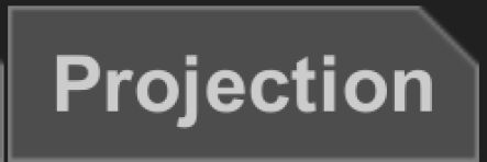 | Tab - not in operation |
 | Button - the next step |
 | Button - is available |
 | Button - is not available |
The numbered lists expand and close the items for selection. The scroll bar moves through a long list of items.
The lists are drop-down lists or numbered lists. For items in drop-down lists, select the item to show the selection.
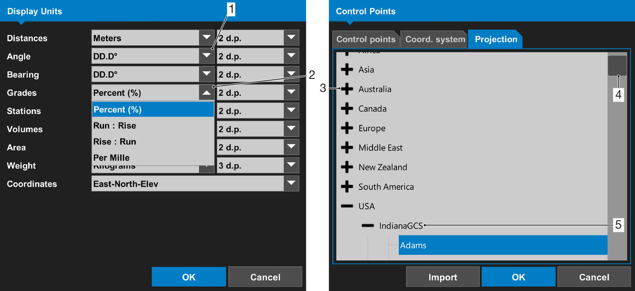
- Expand drop-down list
- Close drop-down list
- Expand list
- Scroll bar
- Close list
Selection controls
The selection controls are checkboxes and radio buttons. The checkboxes have a checkmark when selected. The radio buttons are full when selected.
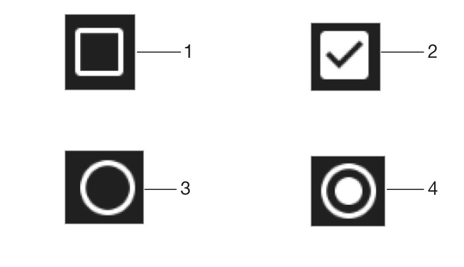
- Checkbox – not selected
- Checkbox – selected
- Radio button – not selected
- Radio button – selected
Previous:
Keyboard
Next:
GX-90 display overview
myTopcon NOW! support
Take your Topcon experience to the next level with myTopcon NOW! This platform is a self-service tool for your desktop or mobile device.